lunes, 6 de septiembre de 2021

The process of researching and developing our new brand was very exciting for us at Kaana. We are very happy with the end result and can’t wait to show it off. In this post, we’ll talk about why we needed to change our brand, how we arrived at the logo you see today, and some thoughts on how it will affect our future growth.
Why did we choose this logo?
Our old logo was a bit old and dated. We wanted to update it in a way that still reflected who we are, but clearly showcased how we’ve grown over time. Since we were already thinking about rebranding, we didn’t waste time coming up with different ideas. We tried to get it right from the start, and fortunately we were able to avoid some big mistakes and make decisions we were really happy with.
When we created the first logo, we didn’t know what we were doing and opted for a simple, basic design. It has worked well for Kaana over time, we’ve even updated the logo over the years, but it’s time for something new. Our brand has grown and changed a lot since then. So we need a logo that keeps up with that growth and represents Kaana.
To give a new approach and in a colorful and impressive way was a great idea, that’s why we decided to go for it and the whole team started working on Kaana’s new rebranding. The new logo is now much better because it enhances all the Kaana products and services and also gives a much higher visibility to the people which we hope will attract many more users.
We hope that the new Kaana brand will be appreciated by the entire community, and we’re very excited to show it to you all. But first we will take a bit of time to show how the logo was created.

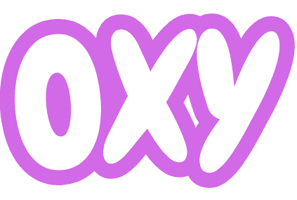
After finding the right version of the logo, we finally decided on the visual identity for Kaana and we started working on the brand guidelines. Once we had the logo approved and the visual identity guidelines set in place, we had to find a font for the new branding, and the graphic design team was given the task of creating an icon for the logo. As a result, we now have one awesome icon for the brand. Take a look at it below:

Designing a logo can be challenging, especially when it has to portray the company’s entire identity in a modern way. We knew that we couldn’t go with a solid and similar color scheme to the previous one. So we started brainstorming and brainstorming and it was clear we wanted to incorporate the vibrant colors and the positive vibes from the whole Kaana team.
The font was finally decided to be Product Sans. This allowed us to work quickly. Of course we also added our logo to the body font, as well as all the colors. We wanted a font with an informal and friendly feel, and it had to be visually appealing and work well with the logo. This is why we went with Product Sans.
When choosing the color palette, we had to consider both how our logo should be displayed and what colors we wanted to use. While it’s hard to say we decided to stick with these five colors. We felt like they had a very vibrant and positive feel, but were also consistent with the company and the design language.

Looking at the logo, it’s clear that there was a lot of thought and work behind the design. But for many reasons we were very happy with the results, and they show us that we’re able to create a brand that we really like.


